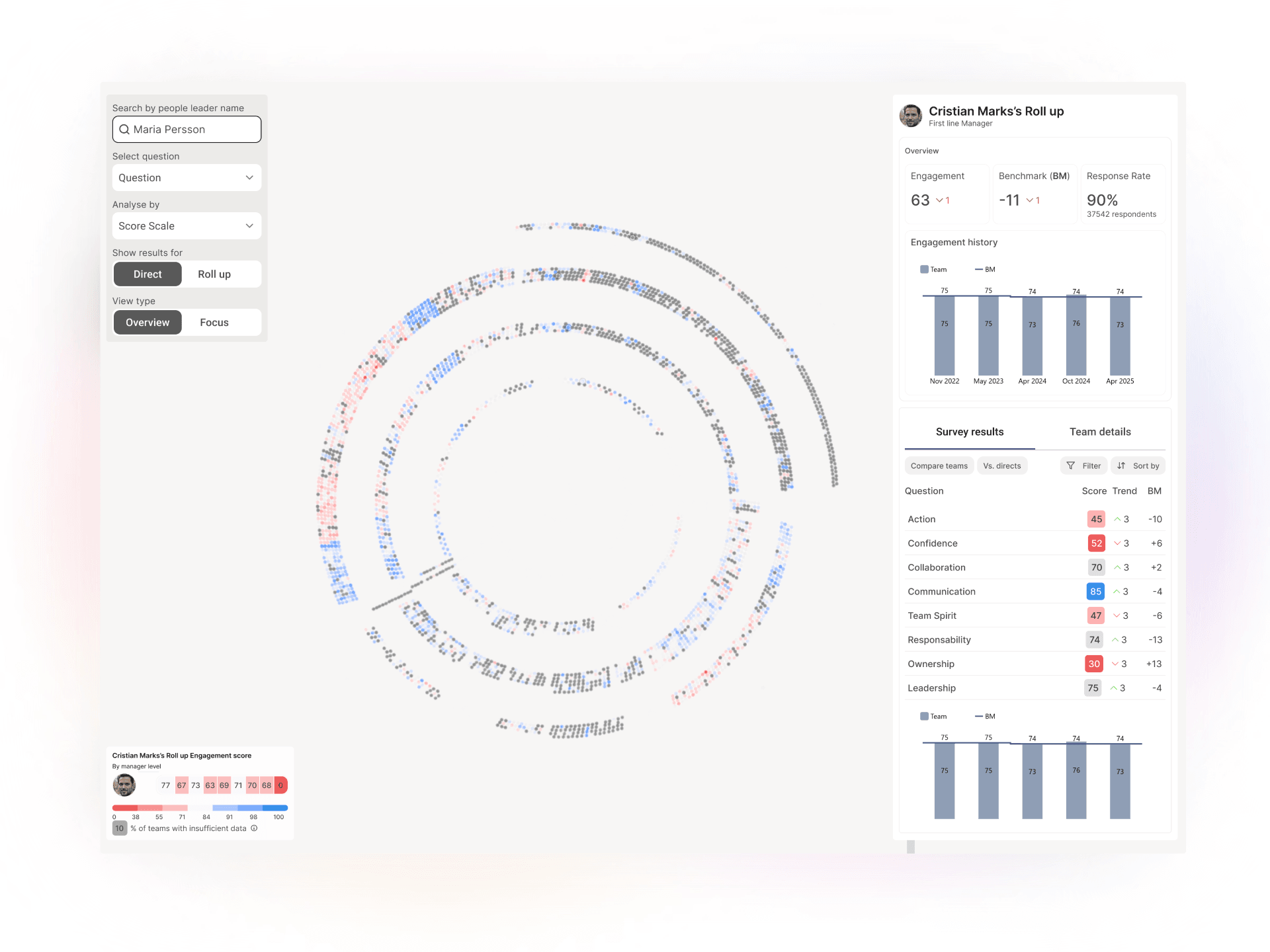
This redesign was part of a platform-wide modernization bringing data intelligence and AI capabilities to our B2B customers. As UX Designer, I worked with a PM/CPO and 3 engineers to transform the form builder from a support-dependent tool into a self-service system for enterprise innovation managers.
TL;DR
Context: For an open innovation platform B2B for enterprises such as Enel, NASA, AstraZeneca, Shell and Dow Chemical, forms are the backbone—they capture ideas, feedback, and proposals that drive innovation.
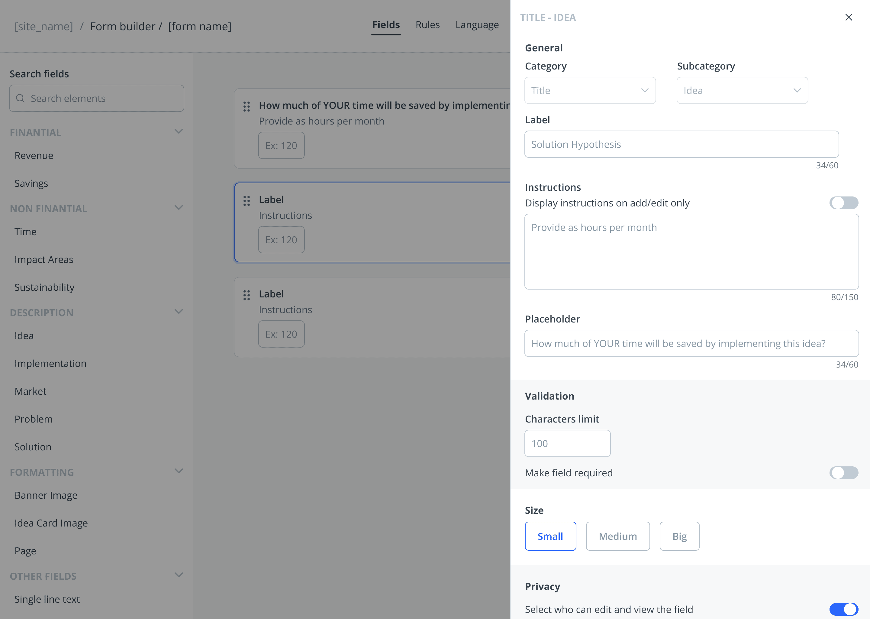
The pain: The existing form builder was over-customized for edge cases, making common tasks frustrating, and every field was plain text—no intelligence to tag data or generate insights in dashboards.
The cost: Innovation managers couldn't work autonomously. When something didn't work or they needed customization, customer service had to intervene manually. This didn't scale.
The opportunity: The company was updating its UI with a new design system. This refresh was the perfect moment to redesign the form builder from scratch—not just visually, but strategically.
Role: UX Designer | Timeline: 7 months | Team: 3 developers and PM/CPO
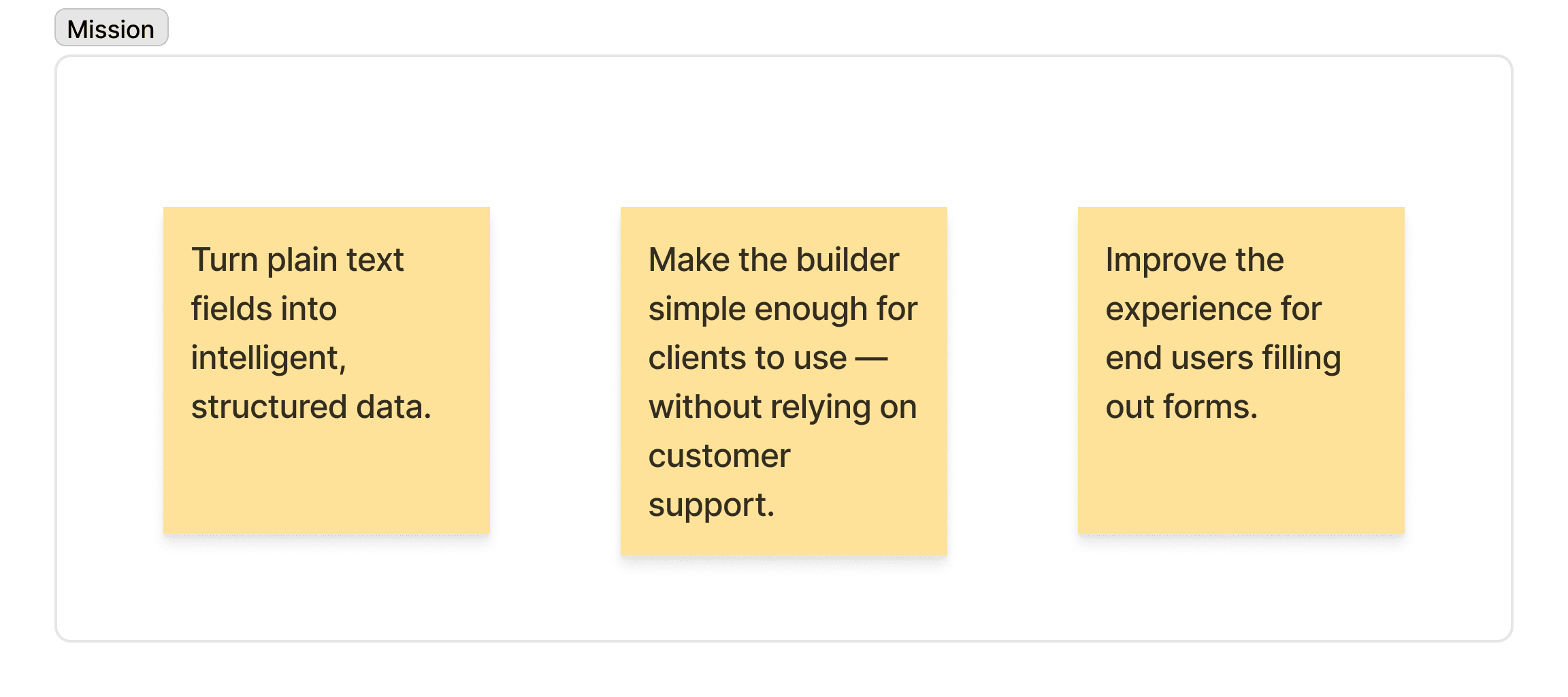
We needed to bring more analytical features based on data and AI to our customers. The constraint: our fields were plain text—no data structure, no way to generate insights automatically.
I received this mission as:
My approach: Instead of starting from scratch, I grounded my strategy in existing knowledge. During multi-day kick-off sessions with engineers, PM, and designers, we had already identified key pain points through customer feedback and platform analytics. I combined this with:
Dogfooding: Collected direct customer feedback through our own platform.
Behavioral analysis: Used Heap Analytics to understand real patterns (do they duplicate forms? where do they get stuck?)
Competitive analysis: Studied MonkeySurvey, Jotform, Visme, Zoho forms.
PM expertise: My PM was also CPO and Customer Head—years of direct customer knowledge guided our priorities.
Design principles
Accessibility as foundation, not add-on
B2B enterprise clients required WCAG AA compliance. The old platform met standards technically, but felt "heavy"—like accessibility was patched on afterward.
The solution: Designed accessible interaction patterns from the start:
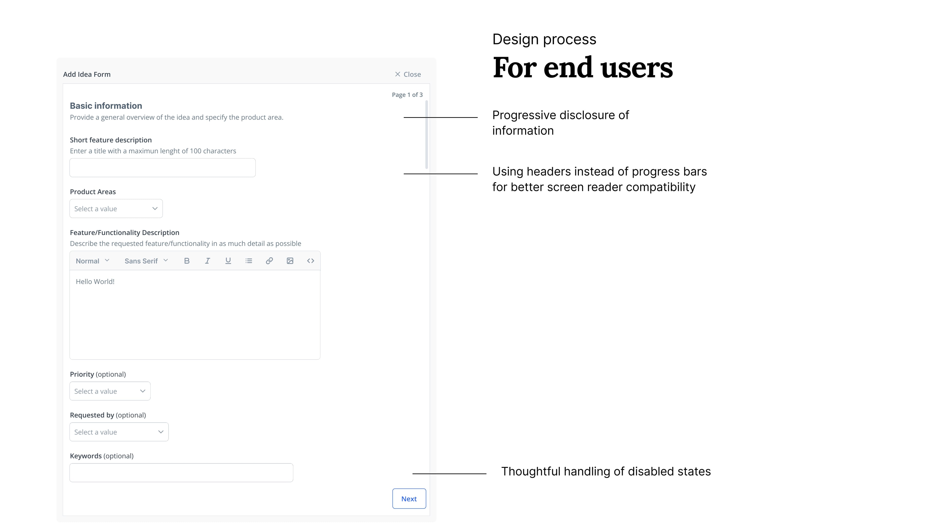
No disabled buttons: Screen readers can't understand them—we showed clear error messages instead.
Optimized keyboard navigation (intuitive, not just "possible")
Page numbering instead of progress bars ("Page 2 of 5" is clearer for everyone)
Field widths that vary (a 5-digit zip code shouldn't have the same width as a full address)
This decision came up when convincing engineering it was worth the effort. The result: compliance didn't feel like a restriction. Patterns were clearer for users with and without disabilities.
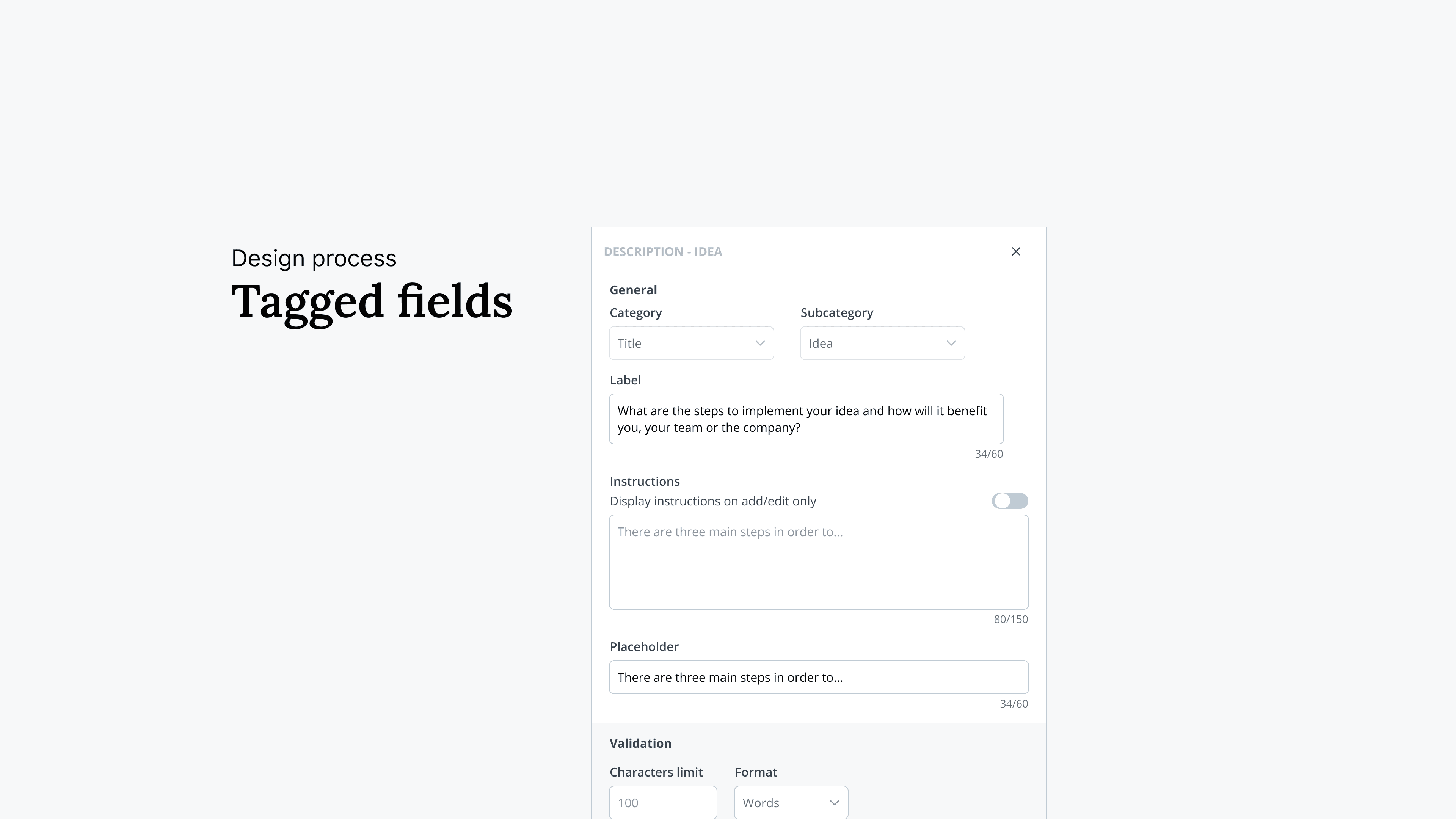
Fields with intelligence—tags, not plain text
The old builder treated everything as plain text. Innovation managers couldn't visualize insights without manual work. So our strategy was that for every field type includes intelligence—tags, data structure, visualization-ready formatting. Admins configure once; dashboards populate automatically.
Simplicity for admins
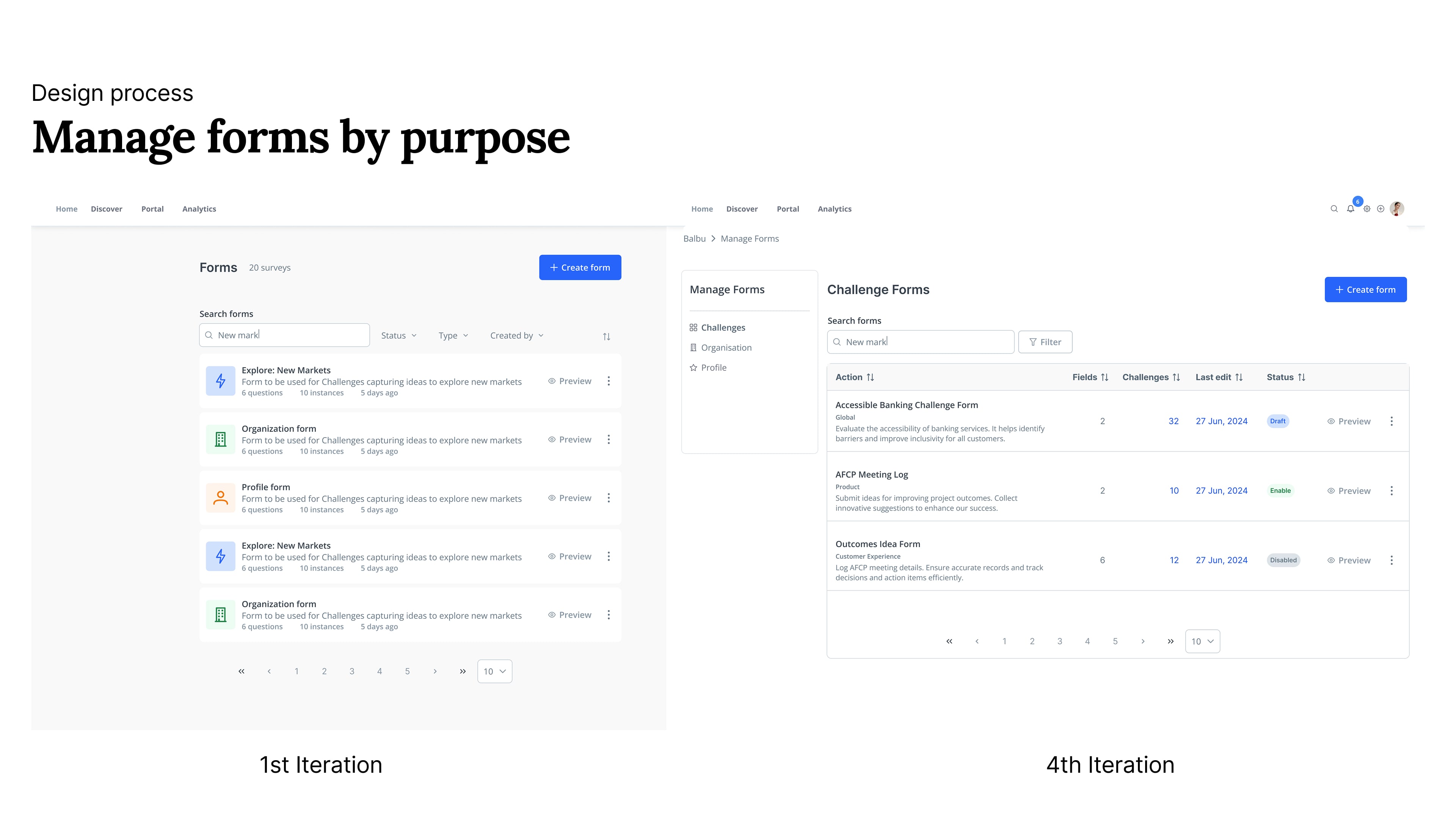
Strategic Template Architecture. We restructured the entire form library. Rather than fighting customization, we embraced it strategically—separating forms by purpose and making templates so compelling that creating from scratch became the less attractive option.
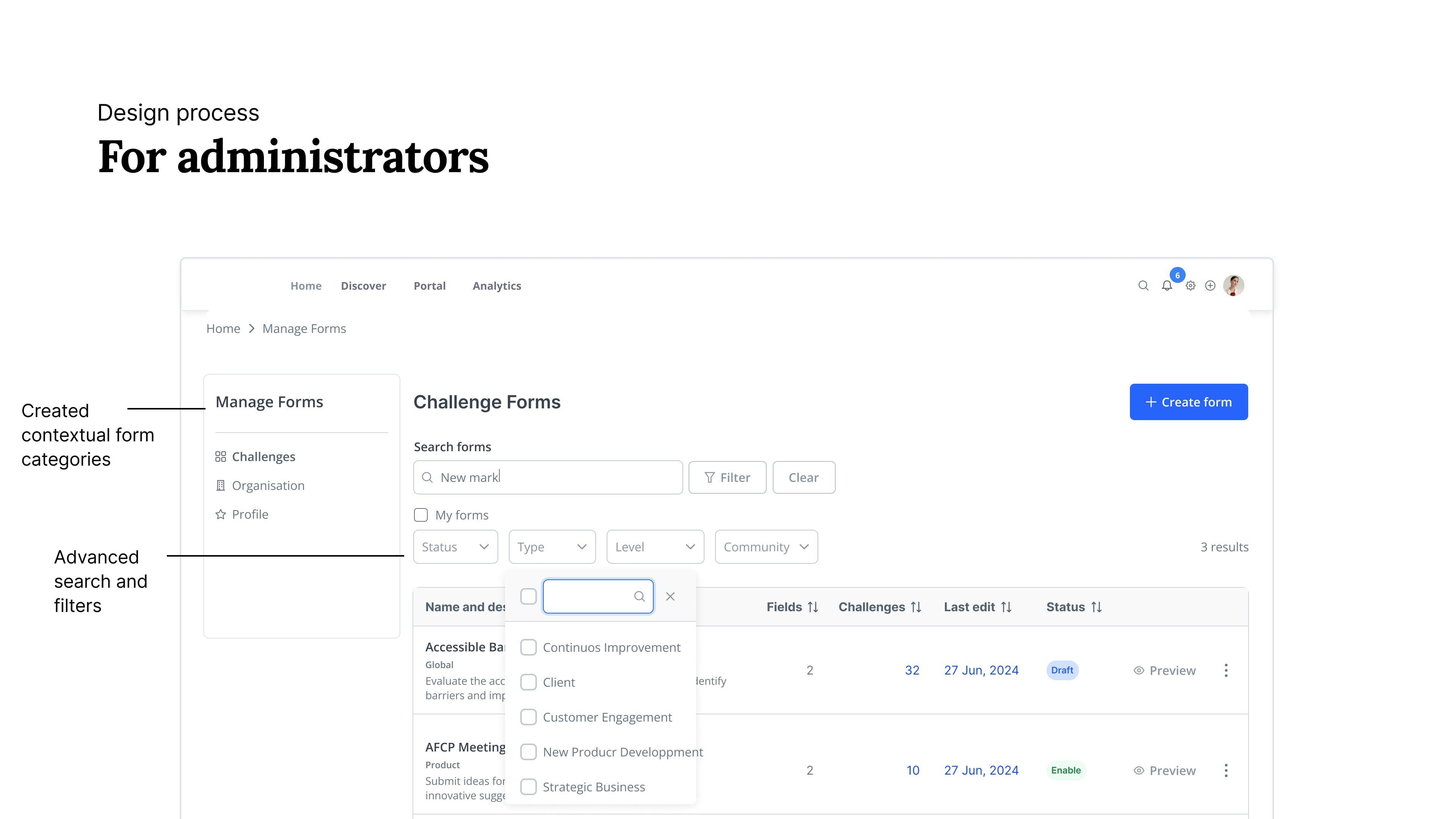
Administrative Efficiency Tools. For administrators managing hundreds of forms, I designed comprehensive filtering, sorting, and bulk action capabilities. This wasn't just about organization—it was about transforming form management from a tedious task into an efficient workflow.
What I would have validated
I left during implementation after delivering phase 1 (manage forms) to engineering and significantly advancing phase 2 (the builder itself), but in case I stayed I would loved to track:
Customer service ticket reduction Hypothesis: Innovation managers could solve problems independently Metric: Tickets related to form creation/editing
Template duplication rate Hypothesis: Users would frequently duplicate templates (signal of usefulness) Metric: % of forms created from templates vs. from scratch
What stayed with me
In B2B, every friction point costs someone time—customer service, end users, admins. Strategic design isn't about perfection; it's about removing the friction that stops people from working autonomously.
Accessibility isn't a checklist—it's a way of thinking. Designing accessible from the start doesn't just meet compliance—it improves the experience for everyone. The most inclusive patterns are often the clearest.
The best tools enable, not restrict. Great B2B design doesn't prevent mistakes by locking features—it guides users to succeed independently. That's what scales.
